Range Slider and Slider Button help users to change input values directly, but the way to customize it varies between browsers like Chome and Firefox. The 4 demos offer gradual tutorials from default settings to awesome appearance settings.
All codes here are not complicated, so you can easily understand even though you are still students in school. To benefit your learning, we will provide you download link to a zip file thus you can get all source codes for future usage.
Estimated reading time: 7 minutes
EXPLORE THIS ARTICLE
TABLE OF CONTENTS
BONUS
Source Code Download
We have released it under the MIT license, so feel free to use it in your own project or your school homework.
Download Guideline
- Prepare HTTP server such as XAMPP or WAMP in your windows environment.
- Download and unzip into a folder that http server can access.
DEMO 1
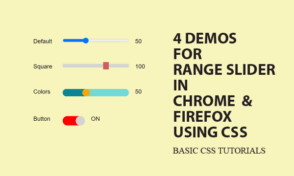
Default Range Slider
HTML Range Slier is an intuitive tool for users to change inputs. Let us begin with default settings, and gradually teach you how to customize its features.
Default in Chrome/Firefox
Let us look the default layout from which we will customize. Though changing its style is almost a CSS approach, default style needs no significant setting in CSS.
Default style for Chrome is shown below.
<input class="basic" type="range" demo="basic" />
<span class="span1 span2" id="basic"></span>
.basic { float:left; width:180px; height:10px; cursor:pointer; margin-left:20px; }
But that is in another style for Firefox.

Show Ranger Slider Changes
Moreover, for displaying changed values, we link <input> to <span> by the term "basic". jQuery operates based on the link. jQuery can detect $('input').change() and link changed $('input') to a specific $('span').
$('input').change(function() {
    ele = $(this);
    demo = ele.attr("demo");
    if (demo == "button") txt = onoff[ele.val()]; else txt = ele.val();
    $('span#'+demo).text(txt);
});
DEMO 2
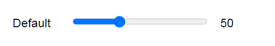
Square Range Slider
This demo simply teaches you how to shape the handle. More changes will be presented later. It is emphased that customization depends on browsers.
Square Thumb
To fit slider thumb to the appearance you want, we add class="square" which is set in CSS. Especially, browsers Chrome and Firefox have different setting in CSS for that. That is, you have to prepare distinct copies of CSS config for these two major browsers.
<input class="basic square" type="range" demo="square" />
Here we want to make thumb square. A thumb is the handle in range slider used to adjust input values.
@supports (-webkit-appearance:none) and @supports (-moz-appearance:none) allow browsers Chrome and Firefox to define their own.
::-webkit-slider-thumb is for Chrome. Only width and height are required to shape the thumb. While background color is optional.
::-moz-range-thumb is for Firefox. Apart from width and height, you have to sharp the corner angle, and eliminate the border from thumb.
-webkit-appearance:none is a must in .square class for Chrome, but not for Firefox.
/* Chrome */
@supports (-webkit-appearance:none) {
    .square { -webkit-appearance:none; background:#d3d3d3; outline:none; }
    .square::-webkit-slider-thumb {
    -webkit-appearance:none; width:15px; height:20px; background:indianred; }
}
/* FireFox */
@supports (-moz-appearance:none) {
    .square { height:10px; background:#d3d3d3; outline:none; }
    .square::-moz-range-thumb { width:15px; height:20px; border-radius:0px; border:none; background:indianred; }
}
DEMO 3
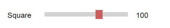
Colorful Range Slider
This is an advanced tip to learn. On slider bar, the moving handle should always keep right side in one color, but left side in different color. In particular, it is a browser-dependent solution.
Thumb Divide Slider Bar into Colors
<input class="basic colors" type="range" demo="colors" />
The upper and lower parts of slider bar separated by thumb should have different colors. This is quite a distinct skill for Chrome and Firefox. Let us begin from the easier one.
Firefox CSS
Starting from Firefox, the terms of progress and track give names to these parts.
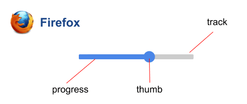
Corresponding to the terms, it is not difficult to realize the following settings.
::-moz-range-progressstands for lower value part of slider bar.::-moz-range-trackstands for higer value part of slider bar.
/* FireFox */
@supports (-moz-appearance:none) {
    .colors { outline:none; }
    .colors::-moz-range-progress { height:20px; background:#0A8594; }
    .colors::-moz-range-track { height:20px; background:#72D9D5; } /* high value color */
    .colors::-moz-range-thumb { width:20px; height:20px; border-radius:10px; background:orange; }
}
/* Chrome */
@supports (-webkit-appearance:none) {
    .colors { -webkit-appearance:none; background:#72D9D5; height:20px;border-radius:10px; overflow:hidden; outline:none; }  /* high value color */
    .colors::-webkit-slider-thumb { -webkit-appearance:none; width:20px; height:20px; background:orange; border-radius:10px; box-shadow: -187px 0 0 180px #0A8594; }
}
Chrome CSS
Next for Chrome, there is no clear defined part, but a trick by box-shadow. Before introducing the trick, let us see where higher and lower parts are.
.colors can be referred to higher value part.
.colors::-webkit-slider-thumb stands for lower value part of slider bar.
box-shadow leverages h-offset, spread to achieve coloring for lower value part. It is to be emphasized that the absolute value of h-offset, spread are not less than .basic { width:180px }.
In addition, overflow:hidden is a must for content overflows.
DEMO 4
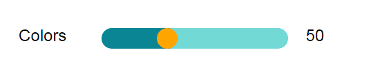
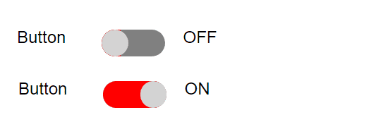
Slider Button
This demo is a variation of Demo 3. It is surprising that a awesome switch button could be done in that way.
Shorten Range Slier As Button
<input class="basic button" type="range" demo="button" />
The variation of Demo 3 turns to be a slider button here for switch on/off. Except range of values and slider length, other features seems the same as that in Demo 4.
/* FireFox */
@supports (-moz-appearance:none) {
    .button { width:60px; outline:none; }
    .button::-moz-range-progress { height:25px; background:red; }
    .button::-moz-range-track { height:25px; background:gray; }
    .button::-moz-range-thumb { width:25px; height:25px; border-radius:15px; background:#d3d3d3; }
}
/* Chrome */
@supports (-webkit-appearance:none) {
    .button { -webkit-appearance:none; background:gray; width:60px; height:25px; border-radius:15px; overflow:hidden; outline:none; }
    .button::-webkit-slider-thumb { -webkit-appearance:none; width:25px; height:25px; background:#d3d3d3; border-radius:15px; box-shadow: -187px 0 0 180px red; }
}
Instead of just displaying values, the 0/1 value should be converted to ON/OFF for slider button.
$('input').change(function() {
    ele = $(this);
    demo = ele.attr("demo");
    if (demo == "button") txt = onoff[ele.val()]; else txt = ele.val();
    $('span#'+demo).text(txt);
})
var onoff = { 0:'OFF', 1:'ON' };
FINAL
Conclusion
This is a CSS solution for layout appearance with alternatives between browsers. If you want more fancy packages like Plugins and Designs, you should install something in your computer. Here we provide only basic facts about this topic.
Thank you for reading, and we have suggested more helpful articles here. If you want to share anything, please feel free to comment below. Good luck and happy coding!
Learning Tips
Let’s suggest a excellent way to learn HTML scripts here. Using Google Chrome F12 Inspect or Inspect Element will help you study the codes.
In Google Chrome, there are two ways to inspect a web page using the browser’s built-in Chrome DevTools:
- Right-click an element on the page or in a blank area, then select Inspect.
- Go to the Chrome menu, then select More Tools > Developer Tools.
Suggested Reading
TRY IT
Quick Experience
That’s all for this project, and here is the link that let you experience the program. Please kindly leave your comments for our enhancement.
Try It Yourself
Click here to execute the source code, thus before studying the downloaded codes, you can check whether it is worthy.