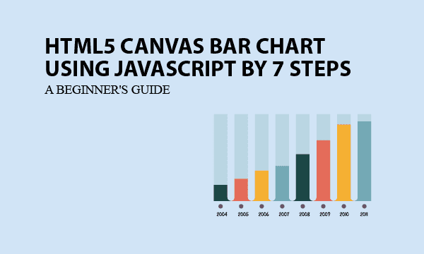
This article offers a complete approach of building a HTML bar chart using JavaScript canvas. In 7 steps, you can customize your bar chart with designed bar colors and the legend to distinguish them. More than one series of data can be set in the chart.
Essentially, the JS object is truly in clear codes without obfuscation. That allow you to extend functions and acts as good tutorial materials. You can use it to create graphics for statistics and trends to analyze data.
All codes here are not complicated, so you can easily understand even though you are still students in school. To benefit your learning, we will provide you download link to a zip file thus you can get all source codes for future usage.
Estimated reading time: 11 minutes
EXPLORE THIS ARTICLE
TABLE OF CONTENTS
BONUS
Source Code Download
We have released it under the MIT license, so feel free to use it in your own project or your school homework.
Download Guideline
- Prepare HTTP server such as XAMPP or WAMP in your windows environment.
- Download and unzip into a folder that http server can access.
SECTION A
The Basics
One of the popular ways to create pixel-based graphics as bar charts is HTML Canvas. To learn about it, compare with other websites, this example has advantage of truely open source without Javascript obfuscation.
Pixel vs. Vector Graphics
Pixel graphics can’t be changed any more once created, but you can modify vector graphics like Scalable Vector Graphics (SVG) format at any time.
HTML Canvas that we will use to build bar charts always produce pixel graphics. You may save them to be of file types such as .JPG, .PNG, etc. HTML Canvas supports most browsers like Chrome, Firefox, Edge, and Safari.
Open Source for The JavaScript Canvas Chart
When embedding other free downloaded Canvas chart codes into your app, you may encounter that some kinds of specific requirements won’t be satisfied, because the kernel source codes have been hidden by Javascript obfuscator or any kind of encryption.
You are lucky as we provide Javascript objects for bar charts with organic design and clear source scripts that can be customized with ease. To clarify, you can fit your prefered design about title, axis labels, legends, etc. to a statistic chart.
SECTION B
Customize Your Bar Chart
The section creates HTML Canvas elements, sets globals such as width, margin, cooridnates, etc, for bar charts. And then a Javascript call makes it clear about how to leverage this example at a glance.
STEP 1. HTML Canvas Element
The very first step is to create a HTML <canvas> element carrying bar charts on. <canvas> has properties of size and id to be recognized by Javascript objects.
<canvas id="mycanvas" width="900" height="500"></canvas>
STEP 2. Global Definition
Secondly, let us get an object canvas by getElementById('mycanvas') in order to define related globals.
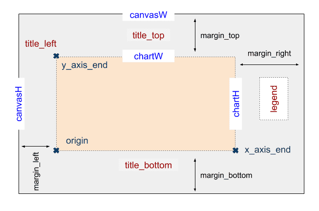
From this object, you can find 3 essential properties, canvasW, canvasH, and ctx. We set ctx to be a two-dimension canvas because bar chart is flat
Look at margin that means the distances of 4 directions between drawings and canvas boundaries. Based on it, we can calculate chart width chartW and chart height chartH.
A coordinate system uses pairs of number to determine the position of points. The coordinate origin stands for a base point in the bar chart. The horizontal x-axis and vertical y-axis cross at origin according to mathematical definition. Also, both x_axis_end and y_axis_end are key cooridnates in our design.
var canvas = document.getElementById('mycanvas');
var canvasW = canvas.getAttribute('width');
var canvasH = canvas.getAttribute('height');
var ctx = canvas.getContext("2d");
var margin = { top: 60, left: 60, right: 150, bottom: 60 };
var chartW = canvasW - margin.left - margin.right;
var chartH = canvasH - margin.top - margin.bottom;
var origin = { x: margin.left, y: margin.top + chartH };
var x_axis_end = { x: origin.x + chartW, y: origin.y };
var y_axis_end = { x: origin.x, y: margin.top };
var title_top = { x: origin.x + chartW/2, y: margin.top/2, text: 'Bar Chart Example' };
var title_bottom = { x: origin.x + chartW/2, y: origin.y + 50, text: 'Sample X Data'  };
var title_left = { x: origin.x, y: y_axis_end.y - 20, text: 'Y Data' };
var legend = { x: x_axis_end.x + 60, y: y_axis_end.y + 60, text: ''};
var legend_colors = [
    {line:'green'},
    {line:'orange'},
    {line:'purple'},
];
Next, you can set coordinates of top, bottom, and left titles along with texts. For instance, the title_top is consisted of not only coordinates but also text content. The other two globals are the same. However, canvas charts have no right label, but reserve the right side for coordinate of legend, which describes each set of data.
Don’t forget to set colors for each series of data by modifying legend_colors, because colors can help us to tell series of points from each other in the whole chart.
STEP 3. Rendering
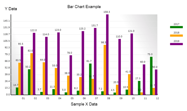
The script bchart.php uses 3 series of sample data to illustrate how you can render the drawing in bar charts. These sample data are of format like $data_p.
Prepare JSON style data on HTML loading by converting $data_p, and then invoke the method bchart.render() of a Javascript object bchart.
<?php
$data_p = array(
'2017'=>[
    ['x'=>'01','y'=>14.7],['x'=>'02','y'=>50.2],['x'=>'03','y'=>5.7],['x'=>'04','y'=>11.3],
    ['x'=>'05','y'=>5],['x'=>'06','y'=>8.2],['x'=>'07','y'=>61.7],['x'=>'08','y'=>7.2],
    ['x'=>'09','y'=>4.5],['x'=>'10','y'=>10.5],['x'=>'11','y'=>27.3],['x'=>'12','y'=>75]
],
'2018'=>[
    ['x'=>'01','y'=>63.5],['x'=>'02','y'=>82],['x'=>'03','y'=>64],['x'=>'04','y'=>53],
    ['x'=>'05','y'=>38],['x'=>'06','y'=>35.2],['x'=>'07','y'=>31.7],['x'=>'08','y'=>98.3],
    ['x'=>'09','y'=>20],['x'=>'10','y'=>41],['x'=>'11','y'=>5],['x'=>'12','y'=>13.7]
],
'2019'=>[
    ['x'=>'01','y'=>95.5],['x'=>'02','y'=>122],['x'=>'03','y'=>114],['x'=>'04','y'=>123],
    ['x'=>'05','y'=>78],['x'=>'06','y'=>125.2],['x'=>'07','y'=>131.7],['x'=>'08','y'=>158.3],
    ['x'=>'09','y'=>110],['x'=>'10','y'=>121],['x'=>'11','y'=>60],['x'=>'12','y'=>50]
],
);
?>
<script>
window.onload = function() {
    var obj_p = <?= json_encode($data_p) ?>;
    bchart.render(obj_p);
};
</script>
In the script bchart.js, what render() does are to calculate mathematics coordinate, to draw background with prefered colors, and to sketch out the X and Y Axises, thus form the skeleton of bar charts. Subsequently, for each set of data, depict_data() creates bars, and then draw_legend() displays legend.
var bchart = {
    .....
    render: function(objects) {
        /* Every drawing in canvas is overlaying with images, rather than vectors. */
        btrans.set(objects);
        this.draw_background();
        this.draw_xy_axis();
        i = 0;
        for (var id in objects) {
            this.dipect_data(objects[id], legend_colors[i], i);
            this.draw_legend(id, i, legend_colors[i]);
            i += 1;
        }
    },
};
SECTION C
Basic Graphic Elements
The basic graphics what bar charts need are lines and texts. In addition to that, we provide an object about how to transform coordinates between bar charts and HTML Canvas by measurement of sample data.
STEP 4. Basic Functions for Line, Text
As mentined in Step 2, the two-dimensional canvas content ctx play an important role for entire HTML Canvas bar chart drawing. The ldraw.line() method can produce lines in awesome colors.
When drawing lines, you can see that ctx.beginPath() and ctx.beginPath() encapsulate all actions for sketching them. In the enclosed area, ctx call methods and set properties to make picture elements satisfied.
var bdraw = {
    line: function(start, end, strokeStyle='blue', lineWidth=1) {
        ctx.lineWidth = lineWidth;
        ctx.strokeStyle = strokeStyle;
        ctx.beginPath();
        ctx.moveTo(start.x, start.y);
        ctx.lineTo(end.x, end.y);
        ctx.stroke();
        ctx.closePath();
    },
    text: function(point, align='center', font='10pt Calibri') {
        ctx.font = font;
        ctx.textAlign = align;
        ctx.fillStyle = 'black';
        ctx.fillText(point.text, point.x, point.y);
    },
}
Apart from lines, the ldraw.text() writes text in a more simple way without enclosure.
STEP 5. Coordinates Transformation
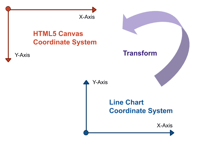
HTML Canvas defines Y values of coordinates from top to bottom, while bar charts have a coordinate system contrary to that. To draw on <canvas> elements, you need to convert from coordinates of bar charts to that of HTML Canvas.
Depending on the range of data, ltrans.set() initializes each value for transformation, and sets properties of object ltrans as below.
y_maxfinds maximal value from all series of input data.data_cntmeans the horizontal count in X-Axis.unit_wis the evenly distance of horizontal labelled unit on X-Axis.unit_his for the evenly distance of vertical Y-coordinates on Y-Axis.- Suppose that Y-Axis has the same count of labelled units as that of X-Axis.
unit_ystands for the average gap value for Y-cooridnates.
var btrans = {
    group_no: 0,
    bar_width: 0,
    data_cnt: 0,
    y_max: 0,
    unit_w: 0,
    unit_h: 0,
    unit_y: 0,
    base: null,
    set: function(objs) {
        // find maximum y value from more than one set of data.
        i = 0
        for (var inx in objs) {
            i +=1;
            for (var id in objs[inx])
                if (objs[inx][id].y > this.y_max) this.y_max = objs[inx][id].y;
        }
        console.log("btrans.y_max="+this.y_max);
        this.group_no = i;
        this.base = objs[inx];
        // calculate xy-axis units based on the first set of data.
        this.data_cnt = this.base.length;
        this.unit_w = chartW/(this.data_cnt);
        this.unit_h = chartH/this.y_max;
        this.unit_y = this.y_max/this.data_cnt;
        this.bar_width = this.unit_w/(this.group_no + 2);
        console.log("btrans.bar_width="+this.bar_width);
    },
    convert: function(data) {
        return pos = {
            x: origin.x + Math.round(data.x * this.unit_w),
            y: origin.y - Math.round(data.y * this.unit_h),
            text: data.text
        };
    },
    adjust: function(pos, adj) {
        return pos = {
            x: pos.x + adj.x,
            y: pos.y + adj.y,
            text: ( adj.text != undefined )? adj.text : pos.text
        };
    }
}
Based on properties, ltrans.convert() transforms coordinates from chart to canvas. In addition, the method ltrans.adjust() helps us to adjust visual difference of distance, or alter labelled texts.
SECTION D
Building JavaScript Canvas Chart
Based on series of data, X-Axis and Y-Axis determine how to scale their units. Next, object bchart sketch out all vertical bars and a legend on the HTML Canvas bar chart.
STEP 6. Sketching X-AXIS & Y-AXIS
It noted that every drawing in HTML Canvas overlays each other to result in one image, rather than plenty of vectors in graphics.
In HTML Canvas, the latter picture will always overlay the previous one, so chart background should be drawn first as bchart.draw_background() does.
var bchart = {
    draw_background: function() {
        // clear before drawing
        ctx.clearRect(0, 0, canvasW, canvasH);
        // draw background
        var grad = ctx.createLinearGradient(origin.x, origin.y, x_axis_end.x, y_axis_end.y);
        grad.addColorStop(0.0, '#D4D4D4');
        grad.addColorStop(0.2, '#fff');
        grad.addColorStop(0.8, '#fff');
        grad.addColorStop(1, '#D4D4D4');
        ctx.fillStyle = grad;
        ctx.fillRect(y_axis_end.x, y_axis_end.y, chartW, chartH);
    },
    draw_xy_axis: function() {
        // locate xy axis units
        var x_axis_units = [];
        var y_axis_units = [];
        var obj = btrans.base;
        for (var id in obj) {
            xout = btrans.convert({x: obj[id].x, y: 0, text: obj[id].x});
            yout = btrans.convert({x: 0, y: id * btrans.unit_y, text: parseFloat(id*btrans.unit_y).toFixed(1)});
            x_axis_units.push(xout);
            y_axis_units.push(yout);
        }
        // draw x-axis & y-axis
        bdraw.line(origin, x_axis_end, 'black', 2);
        bdraw.line(origin, y_axis_end, 'black', 2);
        // draw xy-axis labels and lines
        for (var id in obj) {
            bdraw.text(btrans.adjust(x_axis_units[id], {x:-6, y:20}), 'left'); // x-axis labels
            bdraw.line(x_axis_units[id], btrans.adjust(x_axis_units[id], {x:0, y:-5}), 'black', 2); // vertical short lines
            bdraw.text(btrans.adjust(y_axis_units[id], {x:-5, y:2}), 'right'); // y-axis labels
            if(id == 0) continue;
            bdraw.line(y_axis_units[id], btrans.adjust(y_axis_units[id], {x:chartW, y:0}), '#E8E8E8'); // horizontal lines
        }
        // draw titles
        bdraw.text(title_top, 'center', '14pt Arial');
        bdraw.text(title_bottom, 'center', '14pt Arial');
        bdraw.text(title_left, 'center', '14pt Arial');
    },
    .....
};
To sketch X-axis & Y-axis, you need not only to draw axis lines, but also to create axis unit marks and axis unit labels. For these units, Javascript object ltrans provide two methods convert() and adjust() to properly transform and calibrate related coordinates, respectively.
Then, object ldraw positions 3 titles for the top, left, and bottom, with texts configured in Step 2. Global Definition.
STEP 7. Depicting Bars & Legend
Before drawing, these coordinates for bar charts should be transformed to that for HTML Canvas by ltrans.convert() or adjusted by ltrans.adjust(). Step 2. Global Definition has specified colors in legend_colors for painting on both legend and chart elements.
var bchart = {
    .....
    dipect_data: function(obj, color={line:'blue'}, inx) {
        // locate the data points
        var data_pts = [];
        for (var id in obj) {
            data_pts.push( btrans.convert({x: obj[id].x, y: obj[id].y, text: parseFloat(obj[id].y).toFixed(1)}) );
        }
        // draw bars
        move = (btrans.group_no - inx - 1/2) * btrans.bar_width;
        for (var id in data_pts) {
            start_pts = {x: data_pts[id].x - move, y: origin.y};
            end_pts = btrans.adjust(data_pts[id], {x: -move, y: 0});
            bdraw.line(start_pts, end_pts, color['line'], btrans.bar_width);
            bdraw.text(btrans.adjust(end_pts, {x:-18, y:-8}), 'left', '10pt Calibri');
        }
        console.log(data_pts);
    },
    draw_legend: function(name, inx, color={line:'blue'}) {
        // draw legend for each set of data
        bdraw.line(
            btrans.adjust(legend, {x:0, y:40*inx}),
            btrans.adjust(legend, {x:60, y:40*inx}),
            color['line'], 10
        );
        bdraw.text(btrans.adjust(legend, {x:30, y:40*inx-10, text:name}));
    },
    render: function(objects) {
        /* Every drawing in canvas is overlaying with images, rather than vectors. */
        btrans.set(objects);
        this.draw_background();
        this.draw_xy_axis();
        i = 0;
        for (var id in objects) {
            this.dipect_data(objects[id], legend_colors[i], i);
            this.draw_legend(id, i, legend_colors[i]);
            i += 1;
        }
    },
};
If you want more series of data to be depicted, you can just use the default colors setting or add entries in legend_colors to produce creative painting you prefer. Iteratedly for each set of data, bchart.depict_data() and bchart.draw_legend() will finish the task of drawing a statistic bar chart upon HTML Canvas.
Summary
We have developed a template for canvas bar charts with all clear source codes that is extremely structured and can be customized to fit your needs. Just study these 7 steps for better understanding.
FINAL
Conclusion
It is easy to change titles, positions of tities, colors of lines, and even background texture in our design. Decorated with a legend, it will be an beautiful chart you like. Thank you for reading, and we have suggested more helpful articles here. If you want to share anything, please feel free to comment below. Good luck and happy coding!
Learning Tips
Let us suggest a excellent way to learn HTML scripts here. Using Google Chrome F12 Inspect or Inspect Element will help you study the codes.
In Google Chrome, there are two ways to inspect a web page using the browser built-in Chrome DevTools:
- Right-click an element on the page or in a blank area, then select Inspect.
- Go to the Chrome menu, then select More Tools > Developer Tools.
Suggested Reading
- HTML5 Canvas Line Chart using Javascript by 7 Steps
- Using 3 Events to Sign a Signature on HTML5 Canvas
TRY IT
Quick Experience
That’s all for this project, and here is the link that let you experience the program. Please kindly leave your comments for our enhancement.
Try It Yourself
Click here to execute the source code, thus before studying the downloaded codes, you can check whether it is worthy.