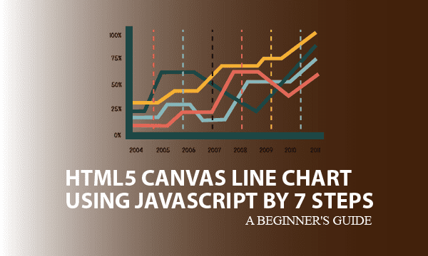
We are proposing an elegant approach to draw HTML5 Canvas line chart. Each line illustrates the distribution of one series of data, and we allow multiple series to be sketched. This article divides the drawing procedure into 7 steps for which several sections explain the principle and usage.
All codes here are not complicated, so you can easily understand even though you are still students in school. To benefit your learning, we will provide you download link to a zip file thus you can get all source codes for future usage.
Estimated reading time: 11 minutes
EXPLORE THIS ARTICLE
TABLE OF CONTENTS
BONUS
Source Code Download
We have released it under the MIT license, so feel free to use it in your own project or your school homework.
Download Guideline
- Prepare HTTP server such as XAMPP or WAMP in your windows environment.
- Download and unzip into a folder that http server can access.
SECTION A
The Basics
The requirement to draw on HTML can be implemented in some ways. We are sharing with you an example to create pixel-based graphics as line charts using the popular HTML5 canvas.
CANVAS vs. SVG
HTML drawing methods can be categorized as pixel graphics and vector graphics. We will discuss the former method here, while you can refer the latter one to the Scalable Vector Graphics (SVG) format.
HTML5 Canvas is popular in pixel graphics, and supports most browsers like Chrome, Firefox, Edge, and Safari.
Definitely Open Source
Many so-called free download for HTML charts drawing on the internet always hide kernel source codes by Javascript obfuscator or any kind of encryption, thus when embedding it in your application programs, you can just use it, but can’t modify it for possible specific requirements.
Fortunately in this example, we provide Javascript objects for line charts with features of organic design and clear source scripts that can be customized. As long as you input data with the format we offer, the resulting line chart will be correct at once. The title, axis labels, legends, etc. can be changed about styles and colors if you want.
SECTION B
Configuration
You have to configure global variables before calling Javascript object methods to render the line chart drawing on HTML5 Canvas elements.
STEP 1. HTML5 Canvas Element
HTML scripts in lchart.php majorly define a HTML element <canvas> with size and id to be identified. All drawings of the chart will be put on it by using Javascript objects that will be explained in the next sections.
<canvas id="mycanvas" width="900" height="500"></canvas>
STEP 2. Global Definition
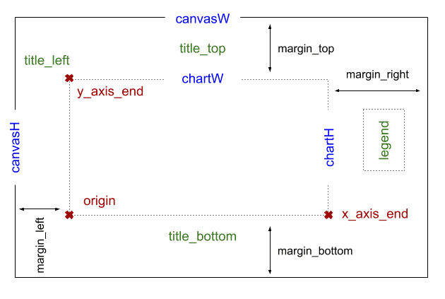
Initially, using getElementById() with id will get an object canvas, and then there are 3 essential properties, canvasW, canvasH, and ctx, to be retrieved from it. As line chart is flat, here we set ctx to be a two-dimension canvas.
margin means the distances of 4 directions between drawings and canvas boundaries. Based on it, we can calculate chart width chartW and chart height chartH.
origin stands for a base point in the coordinate system. The horizontal x-axis and vertical y-axis cross at origin according to mathematical definition. From the view of coordinate system, key coordinates such as origin, x_axis_end, and y_axis_end should be found out.
var canvas = document.getElementById('mycanvas');
var canvasW = canvas.getAttribute('width');
var canvasH = canvas.getAttribute('height');
var ctx = canvas.getContext("2d");
var margin = { top: 60, left: 60, right: 150, bottom: 60 };
var chartW = canvasW - margin.left - margin.right;
var chartH = canvasH - margin.top - margin.bottom;
var origin = { x: margin.left, y: margin.top + chartH };
var x_axis_end = { x: origin.x + chartW, y: origin.y };
var y_axis_end = { x: origin.x, y: margin.top };
var title_top = { x: origin.x + chartW/2, y: margin.top/2, text: 'Line Chart Example' };
var title_bottom = { x: origin.x + chartW/2, y: origin.y + 50, text: 'Sample X Data'  };
var title_left = { x: origin.x, y: y_axis_end.y - 20, text: 'Y Data' };
var legend = { x: x_axis_end.x + 60, y: y_axis_end.y + 60, text: ''};
var legend_colors = [
    {line:'blue', point:'green'},
    {line:'blue', point:'orange'},
    {line:'blue', point:'purple'},
];
Next, let us see how to calculate 3 coordinates for top, bottom, and left titles of this canvas chart. The right side of the canvas chart has no labelled title, but a legend, which usually describes each set of data in a chart. At last, we find out the legend coordinate at right side.
Remember to set colors for each series of data by modifying legend_colors, because these colors can help us distinguish kinds of data points from each other in whole chart. Also, they will be coloring the legend in the same way.
STEP 3. Rendering Line Chart
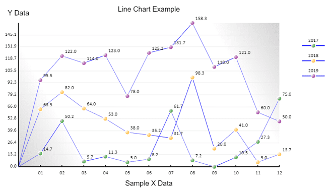
The input data $data_p is what we formulate. As you see, the sample data has 3 series of statistic data to be depicted. As long as you prepare data in this format, it works.
To draw, convert $data_p into JSON style on HTML loading, and then invoke the method lchart.render() of a Javascript object lchart, which will be discussed in the next section.
<?php
$data_p = array(
'2017'=>[
    ['x'=>'01','y'=>14.7],['x'=>'02','y'=>50.2],['x'=>'03','y'=>5.7],['x'=>'04','y'=>11.3],
    ['x'=>'05','y'=>5],['x'=>'06','y'=>8.2],['x'=>'07','y'=>61.7],['x'=>'08','y'=>7.2],
    ['x'=>'09','y'=>0],['x'=>'10','y'=>10.5],['x'=>'11','y'=>27.3],['x'=>'12','y'=>75]
],
'2018'=>[
    ['x'=>'01','y'=>63.5],['x'=>'02','y'=>82],['x'=>'03','y'=>64],['x'=>'04','y'=>53],
    ['x'=>'05','y'=>38],['x'=>'06','y'=>35.2],['x'=>'07','y'=>31.7],['x'=>'08','y'=>98.3],
    ['x'=>'09','y'=>20],['x'=>'10','y'=>41],['x'=>'11','y'=>5],['x'=>'12','y'=>13.7]
],
'2019'=>[
    ['x'=>'01','y'=>95.5],['x'=>'02','y'=>122],['x'=>'03','y'=>114],['x'=>'04','y'=>123],
    ['x'=>'05','y'=>78],['x'=>'06','y'=>125.2],['x'=>'07','y'=>131.7],['x'=>'08','y'=>158.3],
    ['x'=>'09','y'=>110],['x'=>'10','y'=>121],['x'=>'11','y'=>60],['x'=>'12','y'=>50]
],
);
?>
<script>
window.onload = function() {
    var obj_p = <?= json_encode($data_p) ?>;
    lchart.render(obj_p);
};
</script>
Briefly to say, calling render() in lchart.js first begins the mathematics coordinate calculation, draw background with prefered colors, and sketch out the X and Y Axises. Subsequently, for each set of data, depict_data() creates line charts, and then draw_legend() shows legend for clarification.
var lchart = {
    .....
    render: function(objects) {
        /* Every drawing in canvas is overlaying with images, rather than vectors. */
        ltrans.set(objects);
        this.draw_background();
        this.draw_xy_axis();
        i = 0;
        for (var id in objects) {
            this.depict_data(objects[id], legend_colors[i]);
            this.draw_legend(id, i, legend_colors[i]);
            i += 1;
        }
    },
};
SECTION C
Charts Fundamental
We prepare a Javascript object ldraw for drawing points, lines and texts, and another object ltrans to get a core task of coordinate transformation. These Javascript objects will be used in the next section.
STEP 4. Basic Functions for Point, Line, Text
The ldraw.point() method can produce points in awesome gradiant colors by using object grad from ctx. In particular, the Javascript object ctx = canvas.getContext("2d") as mentioned in the previous section is essential for entire HTML5 Canvas line chart drawing.
No matter object methods about points or lines, you can see that ctx.beginPath() and ctx.beginPath() encapsulate all actions to sketch them. In the enclosed area, ctx call methods and set properties to make the picture elements satisfied.
var ldraw = {
    point: function(pt, color='green') {
        var grad = ctx.createRadialGradient(pt.x, pt.y, 8, pt.x - 5, pt.y - 5, 0);
        grad.addColorStop(0, color);
        grad.addColorStop(0.9, 'white');
        ctx.beginPath();
        ctx.fillStyle = grad;
        ctx.arc(pt.x, pt.y, 6, 0, 2 * Math.PI, false)
        ctx.fill();
        ctx.lineWidth = 2;
        ctx.strokeStyle = '#ffffff';
        ctx.stroke();
        ctx.closePath();
    },
    line: function(start, end, strokeStyle='blue', lineWidth=1) {
        ctx.lineWidth = lineWidth;
        ctx.strokeStyle = strokeStyle;
        ctx.beginPath();
        ctx.moveTo(start.x, start.y);
        ctx.lineTo(end.x, end.y);
        ctx.stroke();
        ctx.closePath();
    },
    text: function(point, align='center', font='10pt Calibri') {
        ctx.font = font;
        ctx.textAlign = align;
        ctx.fillStyle = 'black';
        ctx.fillText(point.text, point.x, point.y);
    },
}
Unlike them, the ldraw.text() method writes text in HTML5 Canvas charts in a more simple way without enclosure.
STEP 5. Coordinates Transformation
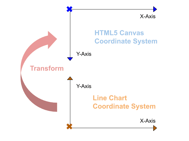
HTML5 Canvas is positioning Y values of coordinates from top to bottom, while line charts have a coordinate system contrary to that. To draw on <canvas> elements, you need to convert from coordinate of line chart to that of HTML5 Canvas.
The ltrans.set() method initializes each calculation for this transformation, and set the following properties of object ltrans.
y_maxfinds maximal value from all series of input data.data_cntmeans the horizontal count in X-Axis.unit_wis the evenly distance of horizontal labelled unit on X-Axis.unit_his for the evenly distance of vertical Y-coordinates on Y-Axis.- Suppose that Y-Axis has the same count of labelled units as that of X-Axis.
unit_ystands for the average gap value for Y-cooridnates.
var ltrans = {
    data_cnt: 0,
    y_max: 0,
    unit_w: 0,
    unit_h: 0,
    unit_y: 0,
    base: null,
    set: function(objs) {
        // find maximum y value from more than one set of data.
        for (var inx in objs)
            for (var id in objs[inx])
                if (objs[inx][id].y > this.y_max) this.y_max = objs[inx][id].y;
        console.log("ltrans.y_max="+this.y_max);
        this.base = objs[inx];
        // calculate xy-axis units based on the first set of data.
        this.data_cnt = this.base.length;
        this.unit_w = chartW/(this.data_cnt);
        this.unit_h = chartH/this.y_max;
        this.unit_y = this.y_max/this.data_cnt;
    },
    convert: function(data) {
        return pos = {
            x: origin.x + Math.round(data.x * this.unit_w),
            y: origin.y - Math.round(data.y * this.unit_h),
            text: data.text
        };
    },
    adjust: function(pos, adj) {
        return pos = {
            x: pos.x + adj.x,
            y: pos.y + adj.y,
            text: ( adj.text != undefined )? adj.text : pos.text
        };
    }
}
The ltrans.convert() method performs the transformation from chart to canvas. Additional method ltrans.adjust() help us adjust visual difference of distance, or alter the text to be labelled.
SECTION D
Drawing From Real Data
Based on series of data, X-Axis and Y-Axis determine how to scale their units. Next, object lchart sketch out all statistic lines and a legend on the HTML5 Canvas line chart.
STEP 6. Sketching X-AXIS & Y-AXIS
One thing you should realize before drawing the chart is the sequence or saying particular order. Every drawing in HTML5 Canvas overlays each other to result in one image, rather than plenty of vectors in graphics.
The latter picture will always cover the previous one, so chart background with the size decided by canvasW and canvasH should be drawn first.
var lchart = {
    draw_background: function() {
        // clear before drawing
        ctx.clearRect(0, 0, canvasW, canvasH);
        // draw background
        var grad = ctx.createLinearGradient(origin.x, origin.y, x_axis_end.x, y_axis_end.y);
        grad.addColorStop(0.0, '#D4D4D4');
        grad.addColorStop(0.2, '#fff');
        grad.addColorStop(0.8, '#fff');
        grad.addColorStop(1, '#D4D4D4');
        ctx.fillStyle = grad;
        ctx.fillRect(y_axis_end.x, y_axis_end.y, chartW, chartH);
    },
    draw_xy_axis: function() {
        // locate xy axis units
        var x_axis_units = [];
        var y_axis_units = [];
        var obj = ltrans.base;
        for (var id in obj) {
            xout = ltrans.convert({x: obj[id].x, y: 0, text: obj[id].x});
            yout = ltrans.convert({x: 0, y: id * ltrans.unit_y, text: parseFloat(id*ltrans.unit_y).toFixed(1)});
            x_axis_units.push(xout);
            y_axis_units.push(yout);
        }
        // draw x-axis & y-axis
        ldraw.line(origin, x_axis_end, 'black', 2);
        ldraw.line(origin, y_axis_end, 'black', 2);
        // draw xy-axis labels and lines
        for (var id in obj) {
            ldraw.text(ltrans.adjust(x_axis_units[id], {x:-6, y:20}), 'left'); // x-axis labels
            ldraw.line(x_axis_units[id], ltrans.adjust(x_axis_units[id], {x:0, y:-5}), 'black', 2); // vertical short lines
            ldraw.text(ltrans.adjust(y_axis_units[id], {x:-5, y:2}), 'right'); // y-axis labels
            if(id == 0) continue;
            ldraw.line(y_axis_units[id], ltrans.adjust(y_axis_units[id], {x:chartW, y:0}), '#E8E8E8'); // horizontal lines
        }
        // draw titles
        ldraw.text(title_top, 'center', '14pt Arial');
        ldraw.text(title_bottom, 'center', '14pt Arial');
        ldraw.text(title_left, 'center', '14pt Arial');
    },
    .....
};
To sketch Axises means not only to draw axis lines, but also to create axis unit marks and axis unit labels. Javascript object ltrans provide two methods convert() and adjust() to properly transform and calibrate related coordinates, respectively.
Moreover, there are 3 titles on the positions of top, left, and bottom to display.
STEP 7. Depicting Points & Legend
To create pictures on a canvas chart, lines were always sketched before drawing points and texts, because of the pixel overlay feature as mentioned in Step 6. These coordinates should be transformed by ltrans.convert() or adjusted by ltrans.adjust() before drawing.
About lines and points coloring, Step 2. Global Definition has specified colors in legend_colors that can paint both legend and chart elements.
var lchart = {
    .....
    depict_data: function(obj, color={line:'blue', point:'green'}) {
        // locate the data points
        var data_pts = [];
        for (var id in obj) {
            data_pts.push( ltrans.convert({x: obj[id].x, y: obj[id].y, text: parseFloat(obj[id].y).toFixed(1)}) );
        }
        // draw lines
        for (var id in data_pts) {
            start_pts = (id == 0)? origin : data_pts[id-1];
            ldraw.line(start_pts, data_pts[id], color['line'], 1);
        }
        // draw points
        for (var id in data_pts) {
            ldraw.point(data_pts[id], color['point']);
            if (data_pts[id].text == 0) continue;
            ldraw.text(ltrans.adjust(data_pts[id], {x:8, y:-8}), 'left', '10pt Calibri');
        }
        console.log(data_pts);
    },
    draw_legend: function(name, inx, color={line:'blue', point:'green'}) {
        // draw legend for each set of data
        ldraw.line(
            ltrans.adjust(legend, {x:0, y:40*inx}),
            ltrans.adjust(legend, {x:60, y:40*inx}),
            color['line'], 2
        );
        ldraw.point(ltrans.adjust(legend, {x:30, y:40*inx}), color['point']);
        ldraw.text(ltrans.adjust(legend, {x:30, y:40*inx-10, text:name}));
    },
    render: function(objects) {
        /* Every drawing in canvas is overlaying with images, rather than vectors. */
        ltrans.set(objects);
        this.draw_background();
        this.draw_xy_axis();
        i = 0;
        for (var id in objects) {
            this.depict_data(objects[id], legend_colors[i]);
            this.draw_legend(id, i, legend_colors[i]);
            i += 1;
        }
    },
};
If you want more series of data to be depicted, just use the default colors setting or add entries in legend_colors to produce creative painting if you will. Iteratedly for each set of data, lchart.depict_data() and lchart.draw_legend() will finish the task of drawing canvas line chart in HTML.
Summary
This example illustates a flexible way to render statistic data into a HTML5 Canvas line chart, and how you can customize it to you needs in 7 steps.
FINAL
Conclusion
We make it easy to change titles, positions of tities, colors of points and lines, and even background texture. Decorated with a legend, it was an awesome chart. Thank you for reading, and we have suggested more helpful articles here. If you want to share anything, please feel free to comment below. Good luck and happy coding!
Suggested Reading
- 7 Steps for HTML Bar Chart Using Javascript Canvas
- Using 3 Events to Sign a Signature on HTML5 Canvas
TRY IT
Quick Experience
That’s all for this project, and here is the link that let you experience the program. Please kindly leave your comments for our enhancement.
Try It Yourself
Click here to execute the source code, thus before studying the downloaded codes, you can check whether it is worthy.